High Lever House, West London
Residential architecture and design
2018 — 2022
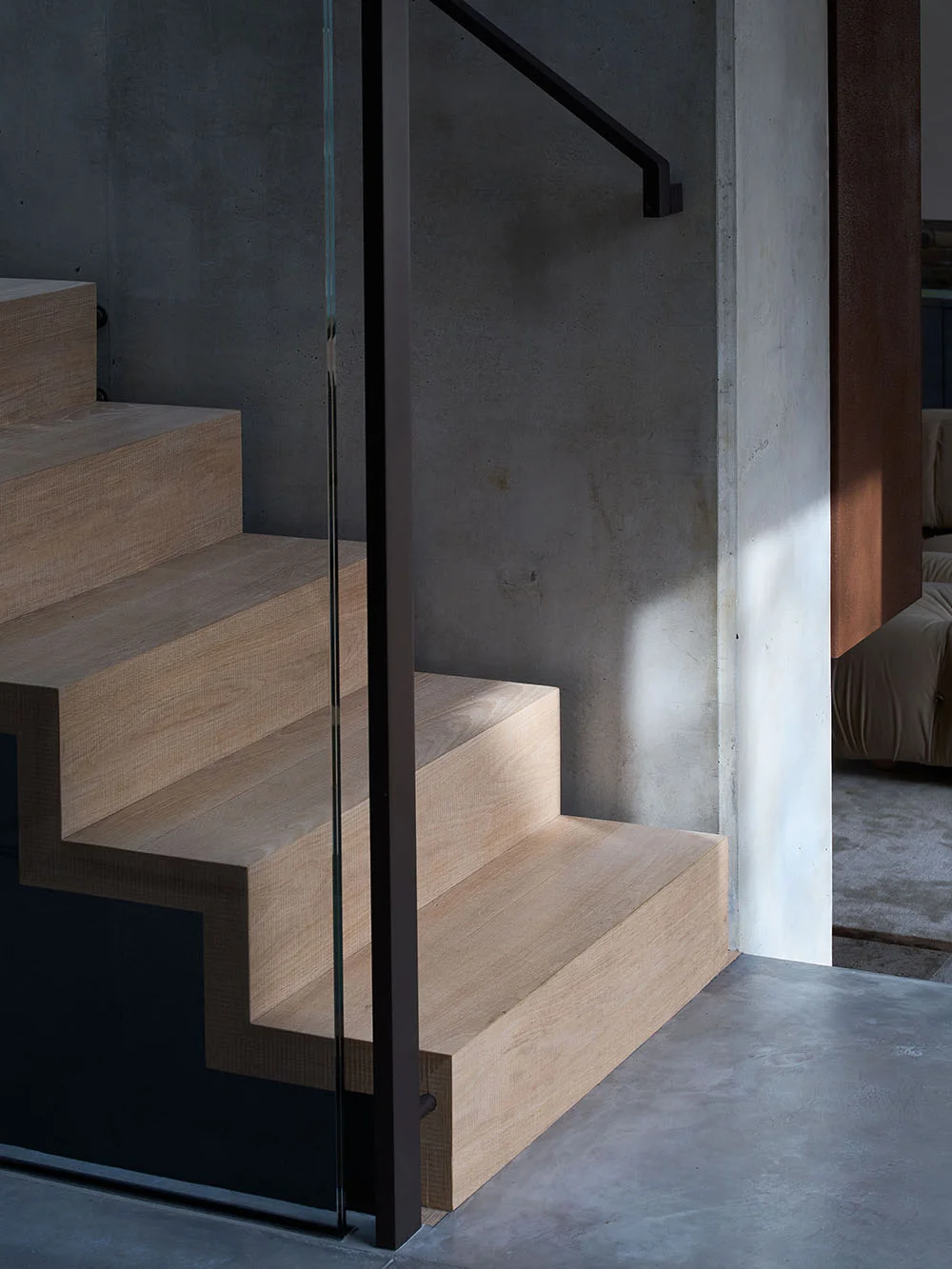
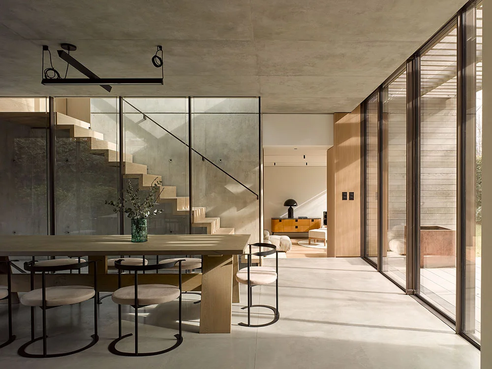
The ambition of this house was to create the unexpected. On entering, you are immediately surprised with a destination view that allows a wonderful sense of vastness, and connects you with the outside. The expansive living space was made possible by the upside down nature of the property — all bedrooms are placed in the basement, harmonised by generous ceiling heights and joyful light wells.
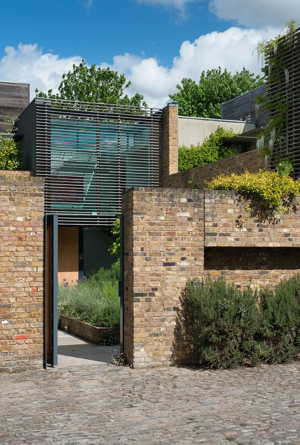
The outside spaces are thoughtfully planted so every view from the house delivers a slightly different dynamic. When you are inside the living space, the garden becomes a beautiful spectacle as it sits at almost table level. The staircase floats in the centre of the house, purposely structured with minimal connections to the side walls. Throughout High Lever we selected materials to enhance the quality, longevity and robustness of the building. This included reclaimed brick and weathered timber — ensuring the building ages gracefully over time.
Team: Adrian Lees, Elisa Modragon, Joanna Dlugosz, Asia Grzybowska, Mark Taylor.
Primrose Hill, London
Residential architecture and design
2018—2022
This beautiful listed house from the 1850s meant our approach had to be discreet — whilst nurturing the building’s legacy. We stripped the interior back to the original elements in their purest form, revealing sacred pine floors and a sensational staircase.
We used honest English oak to form the joinery as a sparring partner to the pine. Brass sanitary wear softened the modernity and period feel of the house. For the landscaping, we collaborated with Todd Longstaffe-Gowan using large planters to juxtapose the scale and stone mosaics that were symbiotic with the architecture.
A new lower ground floor set a modern tone with a concrete floor, a lot of glass edged with elegant galvanised frames and David Groppi lights. Concrete is a fundamental element as you travel through the house, appearing again in the bathrooms and kitchen.
The distinctive metal framework rises up from the lower ground and gradually unravels as it goes higher, passing through the kitchen where we created a vast sense of space — until you reach the roof terrace. Fundamentally, this was a family house that would settle the siblings into different spaces that suited them, whilst keeping the purity of the house as much as possible with less rooms but larger flowing spaces.
Team: Angus Shepherd, Guy Morgan, Leire Echave, interior consultant Sarah Shepherd.
Devon House, South West England
Residential architecture and design
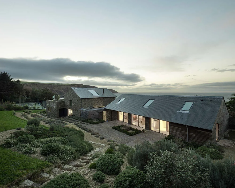
Our client had purchased an existing property on the Devon coast that did not lend itself well to further extension in line with their brief. In collaboration with Julian Powell Tuck, we developed a scheme that created a new build house with a reduced visual impact to the original, and even though larger, is more sympathetic to the surrounding landscape.
The overriding guide from the client was that the building should be ‘more Defender than Range Rover’, meaning materials should be robust and simple. Stone is used both inside and out. Slate tiles and timber cladding enhance the uncomplicated nature of the property.
The property is broken down into three interconnected buildings that nestle together in a line overlooking the beach, with dramatic views to the headland and sea. Internal spaces flow together, with large windows always giving the sense of a clear connection to the external environment. The house is well insulated, with thick walls, and utilises a number of sustainable energy sources.
Winner in the International Property Awards 2018/2019 for Best Residence in South West England.
London House, Notting Hill, London
Residential architecture and design
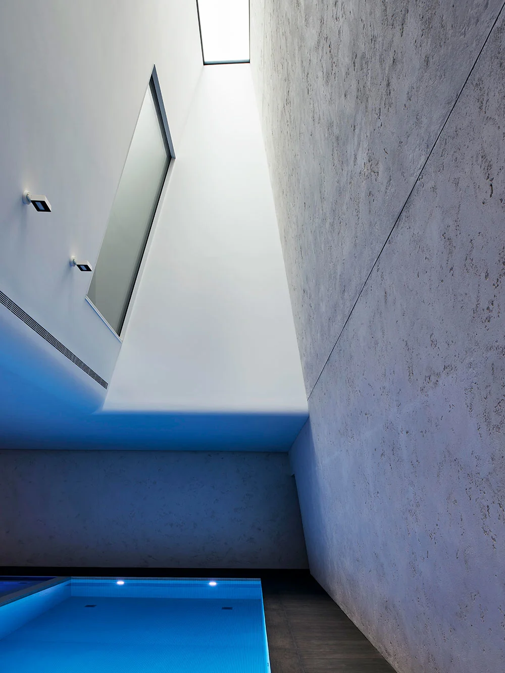
Our international clients approached us to refurbish a large house in Notting Hill, creating a significant double storey basement beneath it. The vast volumes of the basement renovation created spectacular spaces housing the swimming pool, which is located at the base of a 10m tall tapering skylight — extending to the rear garden terrace.
The house provided ample accommodation, including a car lift, cinema, bar, sauna, staff rooms and a summerhouse. Our clients shared our passion for detail, and we enjoyed the opportunity to work closely with them to deliver a project to a very high quality.
Team: Adrian Lees, Steve Appleby
Quantity surveyors & CA: Stockdale
Structural engineers: Conisbee
Services design: Serge Lai
Landscape design: Jinny Blom
AV and lighting: Ideaworks
Contractor: LTSR
Approx: GIA 15,000 square foot
Regents Park II, London
Residential architecture and design
Our client was recommended to us by our friend and creative ally Lina Kanafani, owner of London design store Mint in Kensington. We have collaborated together on many projects including her house on Regents Park Road, contributing to the design of the Mint showrooms, and are currently working on her house in Croatia.
The Regents Park II house was refurbished in 2015, the existing house benefited from its double fronted aspect, a large side extension and a single storey garage.
Proposals embraced these elements by adding a new basement below the side extension and garage, with a small roof terrace onto the roof. The ceiling height to the lower ground floor was increased by sinking the level with the rear garden and with a new rear extension, which creates a very sympathetic and polite approach to how a new contemporary extension can exist with its older host.
Our client has lived in the house with their two children and their nanny, explaining;
“Angus understood our desire for space and light and elegant tranquillity. He and his team exceeded our expectations by far. We are grateful for every day we are able to spend in our home and it has spoiled us for other spaces! While it is temporarily being enjoyed by renters, every estate agent was wowed, and it went on its first viewing without going to market. We couldn’t be happier. Angus and his team created a true masterpiece for us.”
Camden House, London
Residential architecture and design
Previously Monty Python’s Milkwood studios, our longstanding client bought this exciting site from a developer and approached us again to work on this new project.
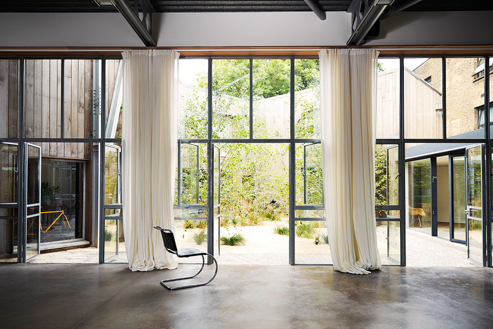
The Camden house is approximately 10,000 square feet, comprising a series of buildings forming a number of lateral spaces, including a vast double height 4,000 square feet studio space, separate projection room, inner courtyard and gated off-street parking area.
We were commissioned to adapt what had already been carried out including a number of key elements to the exterior, including a roof terrace over the existing studio, with planting and a large roof light to the main studio, an entrance extension replacing an existing open porch, a glazed link replacing the open bridge and a carport to the parking area.
Internally, more daylight was introduced, adding a greater sense of space. We worked closely with the client and interior designer on how the spaces were furnished and finished. Refitting bathrooms, designing additional joinery throughout, improving staircases, repositioning the kitchen into the main studio/living area, a new utility area adjoining a new side entrance, and large fireplace to the main studio.
Courtfield Gardens, West London
Residential architecture and design
This project worked within a restricted floor plan to transform a basic West London flat into a more sophisticated interior, balancing the tall windows with comparable spaces. The flat overlooked a garden square and our client describes below how they feel about the renovation, and the processes involved.
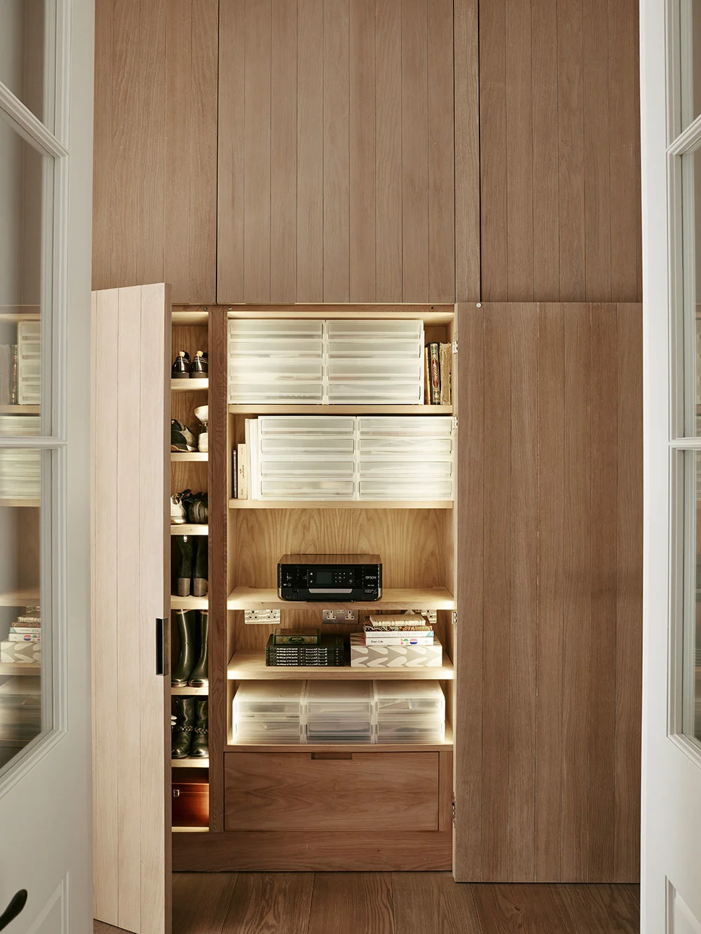
“It is a perpetual joy living in our apartment created by Angus Shepherd, as it was a treat to work with him and his professional and friendly team at PTA. They were always quick to answer emails and phone calls for any queries throughout the project, whilst pursuing all administrative aspects - from architectural plans, schedules, building permissions to engineering calculations - with accessible coherency and precision. Angus has exquisite creative vision and a desire to push the artistic potential for each project to make it truly unique and personal for each client. Within a limited floor plan, foresight and intelligent arrangement maximised on cleverly concealed storage spaces, with everything present but hidden from view - from sockets within floorboards, sound-systems within cupboards, to air-conditioning within the ceiling. A successful synergy of practicality and minimalist beauty.”
Oxford Gardens, London
Residential architecture and design
This residential project was created for an extended family who, excluding the reception rooms, all wanted their own territory. We designed a private parents area with bedroom, bathroom, dressing and sitting room on the top floor. The young children had interconnecting bedrooms, a family bathroom and workspace on the first floor. The main reception rooms; sitting, kitchen, dining, library in the raised ground floor and the lower ground floor served as the older children’s zone — with three bedrooms and bathrooms, a kitchen, family tv room and their own entrance.
At the back of the house we added a two-storey lightweight extension intended to link and unite the ground and lower floors to the garden. Finally, in a new entrance space created under the building our clients wanted a generous gym space, sauna shower and extra storage.
Broderick Road, Wandsworth, London
Residential architecture and design
Our clients first approached us to extend and refurbish their newly purchased Victorian house in Wandsworth. The building was transformed from a dated and fragmented house to a comfortable, family home filled with natural light.
The transformation was split into two phases. The design stayed honest to the original architectural features, whilst bringing it up to contemporary standards and ensuring the rooms flowed seamlessly. This harmonious interaction of space was a guiding principle for us when altering this large house to suit modern family living.
The core design scheme was a sympathetic, but distinctly modern extension to the rear that wouldn’t significantly alter the main house. Critical to the project’s success was devising a fresh, innovative way to unite the existing and new spaces. We used a small, enclosed garden surrounded by glazed walls, and accessible through the study to literally bring the outside in with its light and greenery. This ‘living’ addition provided a clear yet natural boundary between the old and the modern, creating the seamless transition desired.
For phase two, we extended the house with a new basement, the client invited interior designer Henrietta Holroyd Ltd to integrate an equally sympathetic and sophisticated upgrade of the furnishings and finishes. To meet the needs of their growing family, the clients wanted more space, as well as a home that was contemporary and considered in its presentation – crucially, a way that reflected their personality.
From the beginning, this project was about creating a home and work space of uncompromising quality; a sanctuary in the heart of London, tucked away behind an archway and an old brick wall, which was all that remained of the Victorian stables that had once occupied the site.
The outside of the house presents a modest - almost austere - face to the visitor, but one which draws you in through a sequence of ground floor spaces with glazed walls that wrap around two sides of a large courtyard garden.
The material theme throughout is a restrained choice of natural, durable materials which both ground the building and create a sense of quiet. A granite wall stands tall in the double height entrance hall, a glass-sided bridge leads from the main house to the guest wing, worked limestone walls sit unadorned. The house is filled with daylight by the judicious use of courtyards and light wells.
This was a project that we took to with gusto, and that, on completion, exemplified many of the philosophies we believe in - how a space is configured, how it slowly reveals itself, how particular materials and the way they're used bring weight and continuity, and how light can be utilised and played with to endless effect.
“You have created a unique and inspiring building, combining your great architectural strengths with a home that is unmistakably mine.”
Owner of Deepwater
LocationStamford Brook, London
Area 650m2/7,000ft2
Accolades D&AD Winner
Tollgate Drive, Dulwich, London
Residential architecture and design
The bungalow was built in 1966 as part of a development one and two storey houses in Dulwich, South East London. Originally designed by Austin Vernon and Partners and constructed by Wates, the development replaced a series of Victorian villas that ran down College Road. The renovation was for Powell Tuck Associates company director, Angus Shepherd and his wife, Sarah and family. The Shepherds where drawn to the architecturally designed bungalow, its lateral spaces, division between living and bedroom accommodation, secluded aspect, semi-rural setting, and proximately to local schools and acres of play fields.
They lived in the house for couple of years before undertaking works. The key goal was to create more layers of space for the various activities and occupants by changing how the spaces can be used but holding on to the essential feel of the house.
This included the upgrading the thermal performance with a new insulated green roof, cavity insulation and insulated walls linings, new insulated floor slab, and triple glazed windows and doors. Upgrading the services with renewable energy including air source heat pump, solar and thermal panels, underfloor heating and ventilation system with heat recovery.
The interior was completely refurbished, including new full height doors, a new office space and generous sliding doors to divide the spaces as required. Wide plank timber flooring throughout feels expansive, the kitchen, dining and bathrooms were spatially reimagined, configuring a master suite with adjoining dressing and bathroom area.
The hallway offers access to a new basement level, the extension was positioned centrally under the house with a large south facing light well. The space includes a living/cinema room, shower room, large store room, and plant room. This new level creates degree of separation for noisier activities, xbox, sleep overs, and plenty of storage.
Stowe Road, Shepherds Bush, London
Residential architecture and design
2016 — 2018
For this residential project the client already owned the lower ground floor and garden of this London home. Their recent acquisition of the upper ground floor meant there was a desire to reunite the spaces and transform the house into something grand for the family.
We created architectural designs that offered new possibilities for living, and a balance between restoration and contemporary. A key part was the addition of an extensive basement, a complex component that covered the entire footprint of the house with generous ceiling heights. This new level gave way to further opportunity for a secondary entrance and contemporary extension, that would be used as an artist studio.
Colour and day light were the primary considerations to ensure the subterranean spaces didn’t feel underground. We reinstated the original staircase to open out into the kitchen, living room and dining space which was semi-sunken. We played a lot with levels, using lightwells and terraces to provide a sense of space.
The house could now operate in a new way that allowed the kids to enter by the side. We created family meeting points, but also levels of separation and privacy. We readdressed the proportion of the windows to improve the harmony of the rear elevation, creating moments that take you beyond your space. Throughout the project we played with a balance between minimal and loud — working with both the kids and the parents to help shape a space they would love.
Team: Adrian Lees, Guy Morgan, Thomas Denhof
Photography Christopher Horwood
Longs Farm, West Country, England
Residential architecture and design
2010 — 2017
These high-end holiday homes were designed on a former pig farm in an area of outstanding beauty in the West Country. Practice director Adrian Lees grew up locally, so had a deep understanding and empathy for the surrounding landscape.
The architectural concept was rooted in the idea the buildings were remanence of the farm buildings that were once there. We adopted the historical footprint volume, the internal spaces were vast with honest details, as if they had been built in stone and converted. We nestled the buildings into the countryside so they were natural, and non-urban but still contemporary.
Team: Hugh Mackay, Adrian Lees.
Acacia Road, St Johns Wood, London
Residential architecture and design
2019 — 2021
Team: Angus Shepherd, Theodora Koukou
Thornhill Road, Highbury, North London
Residential architecture and design
Our Swedish client who runs a renowned fashion brand had relocated to London with her family. Her brief to us was to create a warm family home that mixes classic townhouse charm with functional, practical modern solutions.
The interior of the house was congested and in need of attention. Our solution was to create new lightwells to the front and rear which, along with a new extension, allowed us to reposition the practical elements of the house: utility room, plant room, WC, cloaks, and storage, so that the main house could become the elegant space that it deserved to be.
We worked closely with the client on the project and interior of the house which had many attractive features that we were careful to preserve. We introduced understated contemporary elements with joinery and furnishings.
Our client had a very clear vision for her garden requesting that it should look ‘slightly wild and natural’. The hard landscaping was designed by us and the planting was by Stuart Craine. Green roofs to the rear extension and garden store were included to further integrate the architecture with the landscaping.
The project was featured in House & Garden magazine, and we were delighted with our clients’ thoughts on it:
“I truly appreciate their design sensitivity, their understanding of how to marry period charm with bold contemporary solutions - all executed with a fastidious attention to detail. They have succeeded in creating a lovely home that feels warm and friendly but also elegant and inspiring.”
“A home every bit as chic as its owner” — House and Garden Magazine
Manchuria Road, Clapham, London
Residential architecture and design
2012
Design proposals were to create a simple kitchen and dining area on this London property that linked back to the existing house, and related more fully to the new courtyard garden.
The architectural plans included new extensions to the rear side return and a small full width extension to form a new single rear extension space. At planning stages, we also submitted an application for a similar extension for the neighbour, allowing for the height of the extension to be optimised.
The project was completed in 2012 and our client and family continue to live and enjoy the space, stating,
“Angus got our vision immediately, the need for simplicity, clean lines, honest materials and textures. He is a master of proportion and scale, with immaculate taste. Highly creative, he encouraged us to go for bespoke fittings, making the space unique to us.
He and his team were professional, clear and concise and always quick to deal with any concerns. On a relatively small budget Angus has created a beautiful kitchen and garden which has stood the test of time, in both design and function, that we are still enjoying years after completion.”
Mint, Duke Street
London, W1U 3ED
Gallery, retail
We were commissioned by our longstanding client to design and restore a historic London shop space on Duke Street, previously home to Dieter Ram’s Vitsoe. The shop restoration required a new staircase, and a transition from a stock room basement into an office and extension of the shop floor.
The original features were preserved and then air conditioning systems and lighting was sensitively installed, as well as a bathroom. The refined finish honoured the architectural heritage and harnessed the contemporary expression of Mint for its customers.
Kensington Park Gardens, London
Residential architecture and design
We were recommended to this project by the clients from our Oxford Gardens renovation. They had bought a Victorian house that had been unsympathetically adjusted over the years, but which had much potential and character.
The principal rooms had incredible cornices which were thick with paint. These were carefully stripped back and restored to the original plaster. Once complete, the clients and ourselves liked the appearance so much we decided to retain the raw plaster. Windows and skirtings were also stripped back to their original Victorian pine, which in turn inspired the use of reclaimed pitch pine for the new timber floors.
While the core of this project was restoration, we also remodeled areas of the house to better suit our clients’ lifestyle and requirements. The locations of the previous kitchen and dining room were swapped around and new openings and adjustments were made to allow a better use of space.
We designed contemporary interiors for the bathrooms, bedrooms and kitchen. We carefully considered the modern elements, so they complemented the original house, rather than fighting against its character. Interior designer Peter Mikic, worked on the soft furnishings and decorations.
Holland Park House, London
Residential architecture and design
This impressive classical terrace on Holland Park Avenue is a listed property, therefore the main elements of works for this project were to carefully balance the restoration of the existing, with sensitive contemporary proposals. The focus of these was within the bathrooms, joinery installations, kitchen, utility, cloakroom and back up areas. The project also included a new rear extension to replace an existing non-original conservatory extension.
The extension was formed using a light steel structure with a glazed roof and sliding glazed doors — allowing it to sit quietly against the existing rear elevation. The extension opens up to the new rear garden which incorporates planting and a pathway leading to the terrace beyond. Trellising, with an integrated lighting strip, encloses the garden, creating a serene setting within the city.
The site for this new build contemporary house, within the curtilage of Avondale Park, had many uses and a colourful past. It was eventually agreed that the original Victorian building would need to be demolished and a new home - echoing the original footprint - would be built in its place.
The house was built and designed for a design journalist and her family, and by introducing a new basement area, we were able to significantly increase the floor area to create a good sized family home, with modest front and rear landscaped gardens. The ground floor is the main living space, with intercommunicating kitchen and reception area and separate workspace. There is a dramatic void over the living space, up to a galleried master bedroom suite above.
Because of the tight site and other restrictions from neighbouring properties, the house is maximised at 210 m2 above ground, but by adding the new basement we were able to create a further 116 m2 below ground. This area, full of light, is a natural progression from the rest of the house, and is more a subterranean living space that belies the fact that it is a basement.
Our client, the owner of Mint, a furniture and interiors retailer, asked us to undertake this project.
This was a major renovation, with a brief to transform a 19th century dwelling into a contemporary home, without giving it an unnatural feeling of modernity.
The house was in a miserable state. A previous owner had turned the three upper floors into bedsits and other strange alterations had taken place and so, while preserving the essential character of the original house, we completely remodelled it to create a modern backdrop for our client’s furniture and art.
Although the house is in a Conservation Area, we successfully negotiated a new glass extension at the rear. This was conceived as part of a new landscaping proposal, which linked the house to the newly landscaped garden.
This Victorian Grade II listed house in a conservation area in Little Venice, north London, had been neglected for many years and remodelled in the 1980s to include a jarring Postmodern white rendered extension. Our client asked us to exorcise all Po-Mo elements, and to completely renovate the entire house, exposing and restoring original features where they had suffered or been hidden over the years.
Our strategy was to get back to the raw architectural framework of the building, to reinstate the original proportions and restore the integrity of the house. Then, once the house felt ready, we grafted in the contemporary requirements. Our aim throughout was to make the alterations clearly readable and allow old and new to sit alongside each other, with the Victorian proportions and details creating a backdrop for a modern space that is more appropriate for contemporary living. The works were closely controlled and scrutinised by the Little Venice Garden Committee, whose stringent restrictions had to be adhered to, and so obtaining permissions was challenging.
We restored the key rooms, mindful of their proportions, and were lucky to find the original Portland stone under layers of finishes in the hall and main stair. The side extension was reconstructed to be clearly distinct from the main house and a new kitchen was built on the upper part of this extension, with vast glass sliding doors to a balcony and commanding view over the garden. The choice of materials and palate created a balanced and natural progression from one area to another, and the garden was given a contemporary look and feel by landscape designer, Christopher Bradley-Hole, creating a more natural connection to the redesigned house.
Our client was an inventor and we had previously worked with him on a commercial property. His ambition was to create an unpretentious house on a modest site, and so he had bought a pretty nondescript bungalow on a 1960s estate, within walking distance of town. Our brief was to work within context, but to build an energy and space efficient house, with a workshop for his future inventions.
Our aim from the outset was to produce a house which had a sense of flow throughout and which seamlessly united the interior with the exterior. We achieved this by utilising the sloping terrain to great effect, sitting the house into the landscape.
We used a simple palette of robust, honest materials - white plaster, reclaimed brick and concrete floors - all of which further embedded the building into the landscape. Dan Pearson designed the external landscape and we particularly enjoyed working with him. His approach, of restoring and enhancing the indigenous landscape, worked perfectly with our strategy for the architecture.
We created the Link Building in a gap between a house and a garage. By incorporating just over 12 sqm external area into the main body of the house, we increased internal floor space by over 40 sqm.
The link gave the opportunity to re-orchestrate the layout of the ground floor of the house. The key objective was to connect different areas of the house, incorporate the external alley way and re-jig functions to make the most of the space. New link-structure unlocked the potential of the back of the house and allowed the creation of a new playroom, improved side entrance and utility areas.
The relation of the existing elements generated the design and the geometry of the proposal. We kept the profile of the new structure low, to manage the difficult junction of the pitched roof of the garage with the new roof and as so not to overpower the existing property’s front door. At the same time, we needed to incorporate the original, very tall side entrance into the design and keep the brick arch visible.
The single pitched glazed roof is set out below existing coping stone to ensure simple junction was achieved between glass and brick. The bulk of this element was carefully hidden behind the angled roof. As you enter further into the extension the roof becomes much simpler - a top-lit glazed element runs parallel along the link with a glass door at the end of the space leading out to the garden.
The external brick wall of the house became an internal feature. The new stone floor relates to the outside space. Specially fitted joinery units form a series of pockets with concealed doors to the kitchen, WC and coat cupboards. Just like magic...now you see them, now you don’t.
The link was carefully detailed. The shadow gap underneath the brick wall, bespoke joinery and a lot of light turned the ‘gap between two buildings’ into a meaningful space that improved lives of our clients.
Project was shortlisted in the New London Architecture Don’t Move Improve! Awards 2019 and presented at the Exhibition in the Building Centre. Winners to be announced on 22nd of January 2019.
Our client found us through mutual friends, with a project to simply refurbish their recently purchased house and replace ramshackle extensions to the rear with a new extension over the three floors. Initial concepts were decided over a few bottles of wine and a couple of sketches and a small card model helped to crystallise the brief.
The solution was a large full width extension at ground level housing a new kitchen, dining and living area, set down to minimise its impact on the house and surroundings. The extension opens into the rest of the ground floor and to the rear garden, and a new large roof light helps fill the new extension with light.
The wedge shaped extension to the upper floors is zinc clad and sits lightly on to the existing rear elevation, its angled form allowing enough space for a bathroom at one level and a smaller shower room above.
This house is part of a development of two live/work units, which includes the offices for the Powell Tuck practice. A bold and contemporary design, the house was built on a very tight budget, in a relatively tight space.
The orientation and format of the living space make optimum use of this potentially overlooked urban backland site and the usual layout has been reversed. Bedrooms are on the ground floor, with living areas upstairs making the most of light and views, where the space opens up dramatically to a 5 metre high ceiling. Light wells and elegant sliding glass panels on two sides send light though the space on even the gloomiest day.
The pragmatic use of honest, rough, inexpensive materials and finishes in the interior creates a utilitarian aesthetic that perfectly suits the building’s crisp linear architecture. Concrete, brick, plaster and breeze block create a sense of space and calm.
Located in an unlovely 1980s office block with a looming atrium, we were tasked to create a dramatic and welcoming entrance sequence for HarperCollins’ London headquarters.
Working on a restricted budget, we were briefed to remodel the main entrance to the building to make it more welcoming and inclusive, address concerns about the atrium, and generally, create a space that better reflects the nature of the business.
The atrium and large, faceless entrance lobby - both cold in winter and hot in summer - presented a typical 1980s corporate look to visitors and staff and our aim was to make the space more welcoming and socially cohesive, improve environmental conditions, and reflect the nature of the company with the introduction of some playful literary elements.
We created a personality and a new hierarchy for the area with the introduction of a number of key features and the lobby now functions as a community space that rotates around the focal point of the reception desk.
The owner of Caramel, a children’s clothing retailer, asked us to work with her after seeing one of our residential projects. We agreed we wouldn’t design a shop that was overtly for children, but rather use the limited palate of materials and sense of space more usually associated with our residential projects. This would have the effect of presenting the merchandise in a more domestic, lifestyle environment, allowing it to take centre stage, rather than having to fight against the colours and busyness more usually associated with children’s retail.
A tough concrete developer finish to the walls was offset by dramatic plaster planes set at a high level. Against this textural backdrop we designed a lightweight and elegant storage system to display the clothes. At the rear of the shop we added a new window for daylight and a diminutive space for reading and drawing. The relatively clutter-free space has the effect of taking the customer on a journey into and through the shop.
Jewellery designer, Jessica McCormack, wanted to create a new bespoke experience and environment for showcasing and selling her jewellery, and we were tasked to convert a Grade II listed building in Mayfair, previously used as offices, into a luxurious home and salon. Originally built as a private house in 1891, by the architect John Evelyn Trollope, the property is part of the redevelopment of Mount Street by the Duke of Westminster.
Our core design solution was to strip the property back to the original, exposing existing details and finishes, including stone stairs and a cast iron balustrade, stone window surrounds, timber window frames and floors, a mosaic floor, mahogany stairs and wall panelling. Beyond this, the design and fit-out was to be driven by Jessica’s collection of artworks, including sculpture, paintings and curiosities, along with some new acquisitions.
We resolved the sequence of layouts and the design of security glazing and jewellery cabinets with a core design solution of stripping back and exposing existing details and finishes. These included stone stairs and a cast iron balustrade, stone window surrounds, timber window frames and floors, a mosaic floor, mahogany stairs and wall panelling. Beyond this, the design and fit-out was to be driven by Jessica’s collection of artworks, including sculpture, paintings and curiosities, along with some new acquisitions.
The house is split into public and private areas, the showrooms occupying the ground and first floor. The rest of the house - basement and floors two to five - are accessed via a private staircase, and the property incorporates a very high level of physical and technical security systems.
The mix of traditional and contemporary pieces, and the natural beauty of the building, make for a striking impression. The overall feel and appeal of the house is that it is personal and unique.
We were approached by these clients on the basis of another of our projects, Oxford Gardens, which they had viewed when it was for sale. They loved the design of that house so much that they wanted one for themselves! So that was the initial brief: an overall feeling of light and space, a strong material palette of washed pine and brickwork, and a high level of detail and design, all working with the existing house. Planning and budgetary constraints meant this brief would be refined, but the project took on its own personality, with an inspiring client.
The house was in a serious condition of decay and infestation, having been unoccupied and sub-divided. Proposals included a complete restoration and refurbishment, including a new basement level and rear extension.
At ground level, a new open plan living, dining, kitchen and separate living area were created. Family bedrooms were on the first floor with the master suite on the top floor. At lower ground level were the family and games room opening on to the garden and guest bedrooms. The new basement below included plant room, utility, wine cellar and gym.
Project was featured in November 2018 on George Clarke's Old House, New Home, Channel 4.
Two previous planning applications for this site, a 1970s suburban-looking property, set in an Area of Outstanding Natural Beauty in the Cotswolds, had been unsuccessful, both at planning and appeal stages. Our strategy to gain permission for a new larger house was to maintain a small and modest structure above ground and take advantage of the sloped site to locate the extra space required below and in this way, planning permission for a larger house was achieved.
Location
Cotswolds
Accolades
Cheltenham Civic Society – Civic Award 2012 New Building
The overall plan was to ensure the house took full advantage of views across to Cheltenham. It was also important to break down the usual barriers and create a building that blended into its surroundings, with the use of local Cotswold stone and a design that echoed the landscape.
The layout of the house is such that it can be lived in on one level only, with further space for family and guests on the floor below. Each room has been carefully conceived to gain maximum potential from the views and a south-facing courtyard provides sheltered space from the prevailing wind from the south west.
As a part of the London Festival of Architecture we've organised a trip to Metropolis Recording Studios in Chiswick. We set of from our office on Saturday morning and made our way to the Old Powerhouse building in the most enjoyable way - guided by Caroline Macmillan of The West London Walks.
It was great to revisit Metropolis Recording Studios and we received some fantastic feedback from our guests. Thank you all for joining us!
https://www.thisismetropolis.com
http://www.westlondonwalks.co.uk
This project was for a couple with a teenage family, all at varying stages of leaving home and heading off to university. A standard London terraced house, they had fallen for its Georgian simplicity, but were shocked by its condition and how it was configured with very little storage, and an arrangement of rooms that meant one was constantly up and down the stairs.
Our brief was to completely refurbish and reconfigure the house, to create a better balance throughout. Levels were rearranged to suit our clients’ family and to make the most of each floor, while working with the existing layouts. This involved converting the existing lower ground floor for the teenage family, with a new basement level under the rear garden, which now provides sufficient layers of separation from the rest of the house. Kitchen and dining is on the ground floor and - taking advantage of the high ceilings and large window - living is on the first. The master bedroom suite is on the second floor.
Throughout the house, the furnishings were chosen by the clients in collaboration with Mint Interiors, who, as previous clients of ours, had recommended Powell Tuck for the project.
Concept
Our objective was to create simple, cost efficient, well-considered, ‘real world’ terraced houses for future generations.
The formula is simple: safe and interconnected neighbourhoods with homes built around a communal garden to embrace a sense of shared space and community and a valuable natural habitat
Design core
The core house is formulated around a simple and considered footprint determined by 5m width. This core is seen as a seed from which adaptation and expansion can flourish to deliver an optimum response to the varying contexts that the houses will exist in.
Interiors have been considered to provide well-proportioned living spaces which can be suitably furnished. Manipulations of internal walls deal with the stuff of modern life, by creating valuable spaces for storage so that the homes are both practical and can easily be personalised by their occupants.
Floorplans can be combined into alternative configurations to create 3-bedroom houses, studio flats, lateral and stacked flats whilst still maintaining the beloved generic of the terrace street.
An elegant Kensington house connected to a stunning communal garden, this property had been heavily converted and stylised and, while unusual, had lost the natural flow of the original design.
Our brief was to piece it back together to create a life home. We achieved this by creating a series of spaces to serve family living, while maximising space and connecting the primary floors with a careful and sympathetic restoration and extension of the rear elevation. We completely stripped out and reconstructed the interior of the property and reinstated a core flow with a new staircase in a style and position respecting the original stair of which only remnants remained.
The house was carefully reordered: the upper ground floor being the more formal reception rooms - a sitting room and study, separated only by a large folding glazed screen. The lower ground floor became the core family space, with a kitchen and sitting/dining area, leading out to a small private garden and on into the communal garden beyond. First, second and third floors provide the master suite, children’s rooms and guest rooms to the top of the house.
The project was an exercise in creating a quietly contemporary home with a sense of logic and respect of the original house. The material selection and interior design were intensely developed with the client to provide a complete design, which fulfilled not only the brief, but preserved the house and extended the building’s use into the future.
One half of a linked pair of houses, this property, located in a Conservation Area, had previously been split into apartments. Our client asked us to maximise the space for this family home and so we decided to excavate a new basement level - from the front garden, under the house, and out under the rear garden - creating more space on an epic scale.
With new extensions at both the lower ground and ground levels, we increased the floor areas by 73%. The strategy was to support the whole of the existing building while the excavation work took place below and, on completion, it was resettled on to a new permanent foundation structure.
We separated the property into two zones, accessed by two new separate staircases. The first rises up from the upper ground floor to the family sleeping areas above. The second descends from the main reception rooms to the kitchen/dining/family space and an underground play space in the basement.
Notting Hill, London
Commercial architecture & design
We had previously worked for these clients on a small arts bar and music venue in Porchester Road, called Cherry Jam. Following its success, the brief for this project was to create a new music venue and club to replace the original Subterania club, built under the Westway in London in the mid 1980s.
Working with a restricted budget, we stripped the venue back to the bare essentials, reorganising and reconfiguring the space. The concept was that the venue would be brand-less, ready to be themed for a particular event or requirement with the use of projected light.
Robust materials such as galvanised steel, painted plaster and resin floor finishes, new technologies and minimal lighting gave the space a new and raw graphic lease of life, and the project illustrates how a significant transformation can be executed at reasonable cost.
Battersea, London
Residential architecture & design
Our clients for this project, for whom we had previously designed a building in Battersea, asked us to restore the house, and retain the key features while creating a contemporary home. The house was in a incredibly neglected, with structural damage at the rear and an upstairs maisonette, unmodernised since the 1930s.
We adopted a creative and collaborative process with our client and took an almost archaeological approach to the existing house, restoring original spaces and retaining and restoring key internal features. We converted the lower ground floor for the older children and the first floor for the younger family. These areas could be separated or integrated as required. The top floor was opened up into the roof to become our client's private zone; with sleeping, sitting, dressing and bathing areas.
An extension was added at the back to increase the lateral space, and new large skylights now flood the house with daylight. Today, the house is a light and modern home, which through judicious restoration of key original features, still manages to reference its past.
Knightsbridge, London
Commercial architecture & design
This project was the first of a group of dental health consultancies in London. Initially, we carried out a feasibility study to establish Knightsbridge as a prime location for this flagship consultancy and we then went on to help develop the brand concept and devise the name Lund Osler.
With a relatively limited floor area, our approach for the design was to keep it clean and immaculate. We took advantage of all available space at the front by creating floor to ceiling windows and the use of bold graphics. Inside, blocks of colour and the manipulation and layering of available space created interest, as well as maximising the floor area.
After the success of Lund Osler in Knightsbridge we completed a new outlet specialising primarily in dental cosmetics, called ‘Face’ by Lund Osler, in Harvey Nichols, Manchester.
Notting Hill, London
Residential architecture & design
This property had few original features, as well as an unsightly two storey back extension that was compromising the small rear garden. It was decided that, architecturally, we would focus on producing a design that would unify the house - to better stand the test of time - rather than retain a front façade that belied a fiercely contemporary interior.
Having said that, beyond the front elevation, the house was completely reconstructed, while great care was taken to respect the proportions and geometry of the restored original frontage, so that it would lock back into the new light and lateral flowing spaces, quite uncharacteristic of the original architecture. The new design allowed for rooms that can be endlessly configured, with doors that can be open to create large spacious areas or closed to step back into the original footprint of the house.
The house is in a Conservation Area, but as it isn’t listed, we were able to negotiate a 40% increase in size by remodelling the back and creating a basement under the lower ground floor. A new garden, designed by Jinny Blom, sits beautifully with the new lines of the house and creates a natural flow from the lower ground floor to the outside.
Wimbledon, London
Residential architecture and design
Our client for this project, a developer, had planning approval for a house in Wimbledon and commissioned our input on the design. The site was sensitive because it was within an existing garden and contained several protected trees. Nevertheless, working within the constraints established by the existing approval, and a very competitive budget, we redesigned the house and obtained permission for our new design.
The layout is L-shaped, with rooms set at half levels off the main stair, and areas that interconnect with a minimum of circulation space. We developed a more considered section with a design that gives all the advantages of open plan living, while still allowing for the practicality, privacy and separation afforded by individual rooms. This house has a relatively modest footprint, but opens out with almost tardis-like qualities once inside.
Riversdale
Wandsworth, London
Residential architecture and design
Our client for this project in Highbury, North London, was introduced to us by our Ambler Road clients, and wanted us to work in the same way with the same builder. The project included the refurbishment of an existing terraced house, and a new roof extension and reworking of the existing rear extensions.
The remodeling included repositioning the kitchen, utility and wc/coats area, new hard landscaping to the front, courtyard and rear gardens, new bathrooms to the upper floors, a dressing room to the master bedroom, and fitted wardrobes to other bedrooms. The new top floor comprises a guest bedroom that discretely doubles up as a hidden cinema and shower room.
Other noteworthy elements include glass landings at each floor, allowing views up through the full height of the house. In the rear garden, the terrace’s patterned tiles reference the design of an traditional rug, and a series of concrete steps disappear up into the garden.
Battersea, London
Architecture & design
1997
Our clients had purchased two adjacent apartments on the east corner of Riverside One, a modern building designed by Foster and Partners, overlooking the Thames, in Battersea. We were commissioned to convert the apartments into one contemporary lateral space, with a simple and streamlined interior of rooms that flow freely into each other.
The apartment was designed to maximise the impact of its spectacular position overlooking Albert Bridge and Chelsea Embankment. The front half of the apartment, which faces the river, comprises a large bedroom, positioned to catch the sunrise, an office and a huge living and dining area, with glass walls on two sides. These rooms can be left open or separated by giant wooden doors.
A muted colour palette was used throughout the apartment - warm honey-toned woods and soft grey beige stone - which offset the cool glassiness of the building. A carpet made in one piece and delivered by river crane, adds further calm and reiterates the sense of flow throughout the apartment.
A constant for every part of the design and choice of materials for this project, was the conviction that this was to be a space with an emphasis on gazing out rather than looking in.
Hampstead, London
Residential architecture and design
Our clients, a celebrated singer and composer and his wife, wanted a major refurbishment to their recently purchased Victorian house in a Conservation Area in Hampstead. We were asked to modernise the house throughout to accommodate their growing family, and to add a further basement level to provide a working recording studio, utility space, and double garage. While still preserving the essential character of the original building, the aim was to create a light and contemporary sequence of spaces, with a living area open to the garden.
The reveal for this house is striking, as the visitor steps beyond an anonymous fence to two processional entranceways, one leading to the front door and the other down to the lower level and garage. The interior of the house was completely reconstructed, with a new staircase, living space, piano room and generous extension on the ground floor. Family bedrooms and bathrooms were sited on the first floor and a spacious master bedroom suite and roof terrace were built into the roof space.
The front of the house was restored so that new works have no impact on the Conservation Area. An unsightly glass conservatory was removed at the rear of the property and a finely detailed glass extension installed in its place. The garden to the back of the house has an almost prehistoric feel, with lush, bold planting right up to the building.
This project was to create a hair and make up studio for Japanese stylist Michio Fukuda. The unit, including a new mezzanine to house utility and office areas, was tiny. Working with the utilitarian aesthetic of the existing concrete shell, we built a slick new installation, reflecting Fukuda's strongly contemporary attitude to hairdressing.
To the existing base of blockwork and concrete shell, we added a sealed sand and cement screed floor. The plasterboard mezzanine fascia and ceiling were painted, and a vibrantly painted MDF stair blade with galvanised metal treads was introduced. Lime coloured ceramic tiles and a maple veneered ply reception counter added to the simple, graphic look of the salon, and careful attention to lighting, texture and colour softened the overall impact. 'Furniture' elements were designed to separate the space into waiting, washing and cutting areas.
Following the success of this project, Powell Tuck Associates was asked to design two sister salons in Tokyo.
Mint
North Terrace, South Kensington
Gallery and store
This store space was previously a Bulthaup showroom designed by John Pawson. We wanted to respect the shell of the Pawson scheme, the legacy of which lay in large limestone slabs and elegant floors. On the shop front, we changed the window frames into solid wood. Inside, we exposed any interesting segments of the original walls to bring some unexpected moments. A new staircase extended the shopping experience down into an expansive basement. New light wells were introduced into the flooring to enhance the lower level.
When we were approached by international financial news agency, Bloomberg, their location in Finsbury Square consisted of two separate sites, each with their own very different style and with complicated occupancy and lease conditions. One had been built in the 1930s by Giles Gilbert Scott and the other was a contemporary office building by Foster and Partners.
We were tasked to carry out a feasibility study and create a master plan for the redevelopment of the whole site. We then provided architecture and design services for the development of a new link building and the fit-out of the two largest buildings.
The centrepiece of our new design was the reworked entranceway, where we created a double height space which draws visitors and staff into the core of the building. The journey up through the building now allows clear sight of the offices and activities taking place, with a contrast from the new technologies used in the entrance to the light and airy pantry area above. Where there had been a disconnect between the two buildings, a key element of the new design worked to bring them together, by introducing a series of walkways.
Alongside these major alterations, the project included detailed fit-out design packages for an auditorium, new TV studios and ancillary technical areas, offices with live broadcast stations, new catering facilities, training rooms, a public art gallery and other art spaces within the complex. We also designed the building signage strategy and system and provided specialist furniture design.
BCO Awards, 2002